
モーダル02
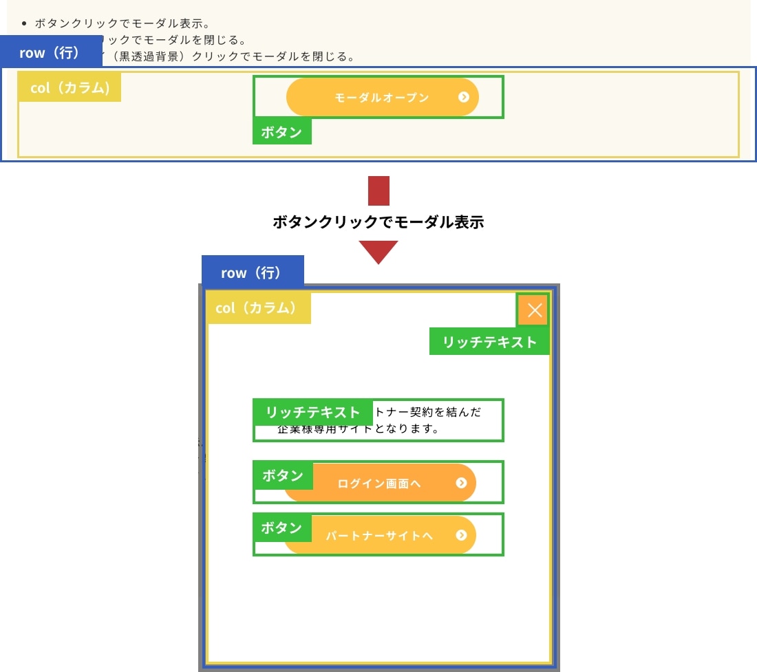
ボタンクリックでモーダル表示
| 追加可能パーツ | 変更可能箇所 | NG | 同一ページに 複数設置 |
|---|---|---|---|
|
■モーダル表示部分
|
|
|
〇 |
| ※留意事項 | |||
|---|---|---|---|
|
※1:通常のモーダルパーツと違ってこちらのパーツは簡易的なモーダルのため、モーダル部分が一つの行(row)で構成されているパーツになります。そのため、〜4カラムまでの行は一つまでしか置けません。 |
デモ
- [モーダルオープン]ボタンパーツをクリックでモーダル表示。
- (リッチテキストで擬似的に作成した)[×]ボタンクリックでモーダルを閉じる。
または、オーバーレイ(黒透過背景)クリックでモーダルを閉じる。
モーダルを閉じるボタン
これより先はパートナー契約を結んだ
企業様専用サイトとなります。

構造図
デモのパーツの構造を説明しています。
設定方法
- CSSをカスタムCSSに記述。
- 編集画面用CSSを適切な位置に記述。
- JavaScriptを使用したいパーツのセクションの一番下に配置。複数ページ設置する場合は共通フッターに配置。
-
クラス名を見本とあわせる。
- モーダル表示のトリガーとなるボタンパーツを配置し、クラス名「js-modal_btn」を追加。リンク先を[このページの一番上に遷移]に設定。
旧CMSの場合:必要に応じて、クラス名「btn_custom01」等を追加。 - 上記パーツのすぐ下にモーダル表示用の行(row)を作成し、クラス名「modal02_row js-modal_row」の2つを追加。
- モーダル表示用の行(row)内の一番上辺りに「リッチテキストパーツ」を配置し、
クラス名「modal02_close_btn js-close_btn」の2つを追加。(=モーダル閉じるボタン) - 横並びのレイアウトの場合、調整が必要になるため適宜該当コメントアウトを外して調整してください。
- 新CMSの場合:基本デザインパーツ(セクションパーツ、複合パーツ、単体パーツ)を使用して問題ありません。
注意点
- クリック時の黒透過背景にスクロール対策を入れていないため、モーダルを参考にして適宜調整を入れてください。
JS・CSS・編集画面用CSS
【旧リッチテキストパーツ】で組み込みが必要な場合にお使いください。
- jS
- CSS
- 編集画面用CSS
2025-10-20更新(v1.1.1)
<script>
'use strict';
/* ----------------
モーダル02 v1.1.1
---------------- */
const modalModule = (() => {
/*------------- 変数定義 【変更可能】 START -------------*/
const modalOpenBtn = document.querySelectorAll('.js-modal_btn')[0]; /* モーダルオープンボタン */
const modal = document.querySelectorAll('.js-modal_row')[0]; /* モーダルrow */
const modalCloseBtn = document.querySelectorAll('.js-close_btn')[0]; /* モーダルクローズボタン */
const html_element = document.getElementsByTagName('html')[0]; /* body */
const body_element = document.getElementsByTagName('body')[0]; /* body */
/*------------- 変数定義 【変更可能】 END -------------*/
/* クローズボタン生成 */
setTimeout(() => {
modalCloseBtn.replaceChildren();
const plainWrapper = document.createElement('div');
plainWrapper.classList.add('modal_close_button_container');
for (let i = 0; i < 2; i++) {
const span = document.createElement('span');
span.classList.add('modal_close_border');
plainWrapper.appendChild(span);
}
modalCloseBtn.prepend(plainWrapper);
}, 300);
/* モーダルオープン */
const openModal = () => {
/* オーバーレイ生成 */
body_element.classList.add('is-modal-open');
html_element.classList.add('is-modal-open');
modal.classList.add('is-show');
};
/* モーダルクローズ */
const closeModal = () => {
body_element.classList.remove('is-modal-open');
html_element.classList.remove('is-modal-open');
modal.classList.remove('is-show');
};
/* クリックイベント */
modalOpenBtn.addEventListener('click', function (e) {
e.preventDefault();
openModal();
});
modalCloseBtn.addEventListener('click', function () {
closeModal();
});
document.addEventListener('click', function(e) {
if (!e.target.closest('.js-modal_row') && !e.target.closest('.js-modal_btn a')) {
/* ハンバーガメニューを閉じる */
closeModal();
} else {
/* ハンバーガメニュー領域内をクリックしたよ */
}
});
})();
</script>
<style>
/* アニメーションの記述 (モーダル表示) */
@keyframes opacity01 {
0% {
opacity: 0;
}
100% {
opacity: 1;
}
}
.js-modal_row {
animation: opacity01 0.3s cubic-bezier(0.45, 0.05, 0.55, 0.95) both;
opacity: 0;
}
.js-modal_row.is-show {
opacity: 1;
}
</style>
<!-- モーダル02 -->
CSS内にデフォルトで用意されている、「JSパーツ集記述場所」の中に追加してください。
※アップセル等で見つからない場合は、LP記述欄の下などに入れてください。
2025-10-20更新(v1.0.1)
/*----- モーダル02 START v1.0.1-----*/
.theme-fo-base .wrapper .contents {
:is(section,section[data-designpart-id]:not(:root:root:root:root)) {
.inner {
.row {
// モーダル JS操作
&.js-modal_row {
display: none;//読み込み時非表示
/*クリックでモーダル表示*/
&.is-show {
display: block !important;
// display: flex !important;//複数カラムの場合は、blockで縦になるのでこちらを使用
}
}
// モーダル スタイル調整
&.modal02_row {
position: fixed;
z-index: 10000;
top: 50%;
left: 50%;
width: 100%;
max-width: 500px;
padding: 20px;
color: #000;
background: #fff;
transform: translate(-50%, -50%);
@include breakpoint-sp {
max-width: 500px;
padding: 60px 20px !important;
}
@include breakpoint-ssp {
max-width: calc(100% - 40px);
padding: 60px 20px !important;
}
.col {
display: flex !important;
flex-direction: column;
align-items: center;
justify-content: center;
width: 100%;
min-height: 500px;
padding: 0;
@include breakpoint-sp {
min-height: 450px;
}
@include breakpoint-ssp {
min-height: 300px;
}
.component {
@include breakpoint-sp {
width: 100%;
}
&.modal02_close_btn {
cursor: pointer;
position: absolute;
top: 0;
right: 0;
width: 50px;
height: 50px;
margin: 0;
background: #ffad2f;
span.modal_close_border {
display: inline-block;
position: absolute;
width: 27px;
height: 2px;
border-radius: 1px;
background-color: #fff;
&:nth-of-type(1) {
top: 17px;
left: 12px;
transform: translateY(7px) rotate(-45deg);
}
&:nth-of-type(2) {
bottom: 17px;
left: 12px;
transform: translateY(-7px) rotate(45deg);
}
}
}
}
}
}
}
}
}
}
// モーダルオーバーレイ
html {
&.is-modal-open {
overflow: hidden;
height: -webkit-fill-available;
}
}
body {
&.is-modal-open {
position: relative;
&::before {
content: "";
position: absolute;
z-index: 10000;
top: 0;
left: 0;
width: 100%;
height: 100%;
background: rgba(0, 0, 0, 0.5);
}
}
}
/*----- モーダル02 END -----*/
編集画面CSS内にデフォルトで用意されている、「//JSパーツの記述はここにお願いします」の中に追加してください。
※アップセル等で見つからない場合は、@include edit-page {}内に必ず入れてください。
2024-09-17更新(v1.0.0)
/*-- モーダル02 編集画面用 START v1.0.0--*/
:is(section,section[data-designpart-id]:not(:root:root:root:root:root:root)) {
.inner {
.row {
&.js-modal_row {
display: block !important;
// display: flex !important;//複数カラムの場合は、blockで縦になるのでこちらを使用
}
&.modal02_row {
position: relative !important;
z-index: initial;
top: initial;
left: initial;
width: 80%;
margin: 40px auto;
transform: initial;
border: 1px solid #000;
&::before {
content: "モーダル(ボタンクリックで表示)";
position: absolute;
color: #fff;
background: #000;
padding: 5px 5px;
right: 0;
top: -24px;
font-size: 14px;
line-height: 1;
}
.col {
display: flex !important;
position: relative !important;
.component {
width: 100%;
}
.modal02_close_btn {
position: relative;
width: 100% !important;
border: 1px solid red !important;
&::before {
content: "モーダルの閉じるボタン(削除しないでください)";
position: absolute;
color: #fff;
background: red;
padding: 5px 5px;
right: 0;
top: -24px;
font-size: 14px;
line-height: 1;
}
}
}
}
}
}
}
/*-- モーダル02 編集画面用 END --*/
旧リッチテキストパーツ用
JS・CSS・編集画面用CSS
【旧リッチテキストパーツ】で組み込みが必要な場合にお使いください。
- jS
- CSS
- 編集画面用CSS
2025-10-20更新(v1.0.1)
<script>
'use strict';
/* ----------------
モーダル02 v1.0.1
---------------- */
const modalModule = (() => {
/*------------- 変数定義 【変更可能】 START -------------*/
const modalOpenBtn = document.querySelectorAll('.js-modal_btn')[0]; /* モーダルオープンボタン */
const modal = document.querySelectorAll('.js-modal_row')[0]; /* モーダルrow */
const modalCloseBtn = document.querySelectorAll('.js-close_btn')[0]; /* モーダルクローズボタン */
const html_element = document.getElementsByTagName('html')[0]; /* body */
const body_element = document.getElementsByTagName('body')[0]; /* body */
/*------------- 変数定義 【変更可能】 END -------------*/
/* クローズボタン生成 */
modalCloseBtn.innerText = '';
for (let i = 0; i < 2; i++) {
let modalCloseBorder = document.createElement('span');
modalCloseBorder.classList.add('modal_close_border');
modalCloseBtn.appendChild(modalCloseBorder);
};
/* モーダルオープン */
const openModal = () => {
/* オーバーレイ生成 */
body_element.classList.add('is-modal-open');
html_element.classList.add('is-modal-open');
modal.classList.add('is-show');
};
/* モーダルクローズ */
const closeModal = () => {
body_element.classList.remove('is-modal-open');
html_element.classList.remove('is-modal-open');
modal.classList.remove('is-show');
};
/* クリックイベント */
modalOpenBtn.addEventListener('click', function (e) {
e.preventDefault();
openModal();
});
modalCloseBtn.addEventListener('click', function () {
closeModal();
});
document.addEventListener('click', function(e) {
if (!e.target.closest('.js-modal_row') && !e.target.closest('.js-modal_btn a')) {
/* ハンバーガメニューを閉じる */
closeModal();
} else {
/* ハンバーガメニュー領域内をクリックしたよ */
}
});
})();
</script>
<style>
/* アニメーションの記述 (モーダル表示) */
@keyframes opacity01 {
0% {
opacity: 0;
}
100% {
opacity: 1;
}
}
.js-modal_row {
animation: opacity01 0.3s cubic-bezier(0.45, 0.05, 0.55, 0.95) both;
opacity: 0;
}
.js-modal_row.is-show {
opacity: 1;
}
</style>
<!-- モーダル02 -->
CSS内にデフォルトで用意されている、「JSパーツ集記述場所」の中に追加してください。
※アップセル等で見つからない場合は、LP記述欄の下などに入れてください。
2025-10-20更新(v1.0.1)
/*----- モーダル02 START v1.0.1-----*/
.theme-fo-base .wrapper .contents {
:is(section,section[data-designpart-id]:not(:root:root:root:root)) {
.inner {
.row {
// モーダル JS操作
&.js-modal_row {
display: none;//読み込み時非表示
/*クリックでモーダル表示*/
&.is-show {
display: block !important;
// display: flex !important;//複数カラムの場合は、blockで縦になるのでこちらを使用
}
}
// モーダル スタイル調整
&.modal02_row {
position: fixed;
z-index: 10000;
top: 50%;
left: 50%;
width: 100%;
max-width: 500px;
padding: 20px;
color: #000;
background: #fff;
transform: translate(-50%, -50%);
@include breakpoint-sp {
max-width: 500px;
padding: 60px 20px !important;
}
@include breakpoint-ssp {
max-width: calc(100% - 40px);
padding: 60px 20px !important;
}
.col {
display: flex !important;
flex-direction: column;
align-items: center;
justify-content: center;
width: 100%;
min-height: 500px;
padding: 0;
@include breakpoint-sp {
min-height: 450px;
}
@include breakpoint-ssp {
min-height: 300px;
}
.component {
@include breakpoint-sp {
width: 100%;
}
&.modal02_close_btn {
cursor: pointer;
position: absolute;
top: 0;
right: 0;
width: 50px;
height: 50px;
margin: 0;
background: #ffad2f;
span.modal_close_border {
display: inline-block;
position: absolute;
width: 27px;
height: 2px;
border-radius: 1px;
background-color: #fff;
&:nth-of-type(1) {
top: 17px;
left: 12px;
transform: translateY(7px) rotate(-45deg);
}
&:nth-of-type(2) {
bottom: 17px;
left: 12px;
transform: translateY(-7px) rotate(45deg);
}
}
}
}
}
}
}
}
}
}
// モーダルオーバーレイ
html {
&.is-modal-open {
overflow: hidden;
height: -webkit-fill-available;
}
}
body {
&.is-modal-open {
position: relative;
&::before {
content: "";
position: absolute;
z-index: 10000;
top: 0;
left: 0;
width: 100%;
height: 100%;
background: rgba(0, 0, 0, 0.5);
}
}
}
/*----- モーダル02 END -----*/
編集画面CSS内にデフォルトで用意されている、「//JSパーツの記述はここにお願いします」の中に追加してください。
※アップセル等で見つからない場合は、@include edit-page {}内に必ず入れてください。
2024-09-17更新(v1.0.0)
/*-- モーダル02 編集画面用 START v1.0.0--*/
:is(section,section[data-designpart-id]:not(:root:root:root:root:root:root)) {
.inner {
.row {
&.js-modal_row {
display: block !important;
// display: flex !important;//複数カラムの場合は、blockで縦になるのでこちらを使用
}
&.modal02_row {
position: relative !important;
z-index: initial;
top: initial;
left: initial;
width: 80%;
margin: 40px auto;
transform: initial;
border: 1px solid #000;
&::before {
content: "モーダル(ボタンクリックで表示)";
position: absolute;
color: #fff;
background: #000;
padding: 5px 5px;
right: 0;
top: -24px;
font-size: 14px;
line-height: 1;
}
.col {
display: flex !important;
position: relative !important;
.component {
width: 100%;
}
.modal02_close_btn {
position: relative;
width: 100% !important;
border: 1px solid red !important;
&::before {
content: "モーダルの閉じるボタン(削除しないでください)";
position: absolute;
color: #fff;
background: red;
padding: 5px 5px;
right: 0;
top: -24px;
font-size: 14px;
line-height: 1;
}
}
}
}
}
}
}
/*-- モーダル02 編集画面用 END --*/

© Basic Inc. All Rights Reserved.